Enhancing Efficiency and Usability
Conducted a full UX audit and implemented key fixes to improve usability and conversion
UX Audit
US Based
2024

1. Project Overview
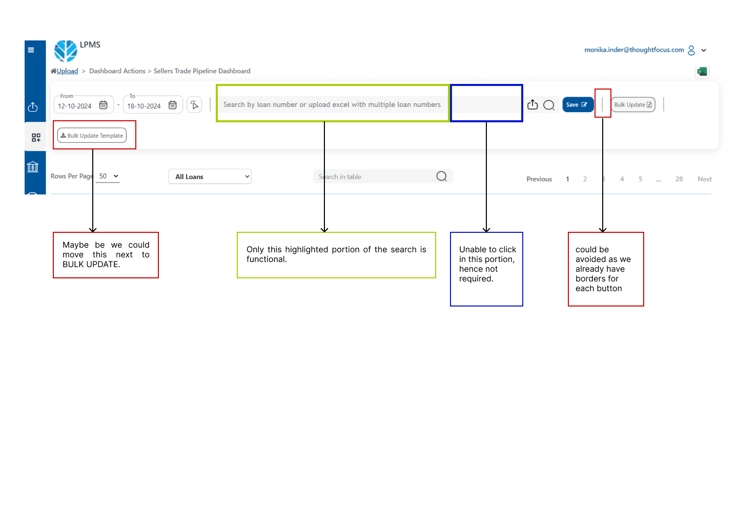
The Project dashboard is designed to manage seller trade pipelines, loan records, and documentation workflows. However, several user experience issues were identified related to alignment, navigation, usability, loading experience, and content presentation.
The goal of this UX audit was to identify usability bottlenecks, enhance data accessibility, optimize user interactions, and improve the overall visual clarity of the application.
2. Audit Scope
Screens and elements analyzed:
Data table views
Filter and search functionality
Side navigation menu behavior
Loading animations and feedback mechanisms
Button and control placements
3. Key Problems Identified
Area | Issue | Impact |
|---|
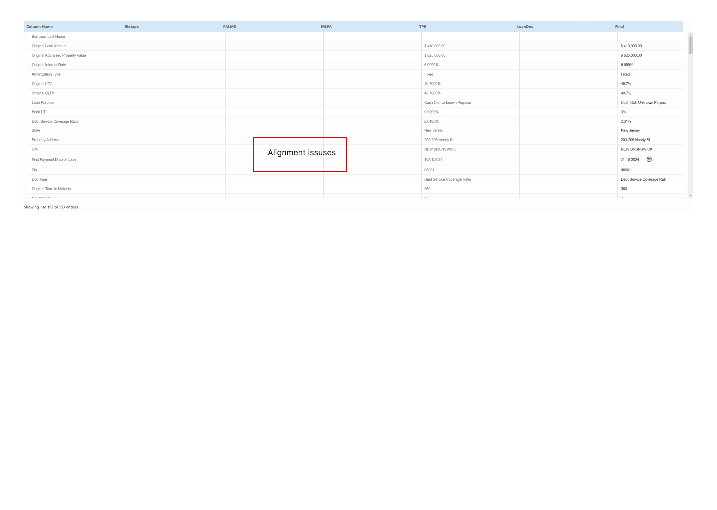
Data Tables | Misalignment between columns and missing data placeholders | Users lose trust and find it hard to trace data |
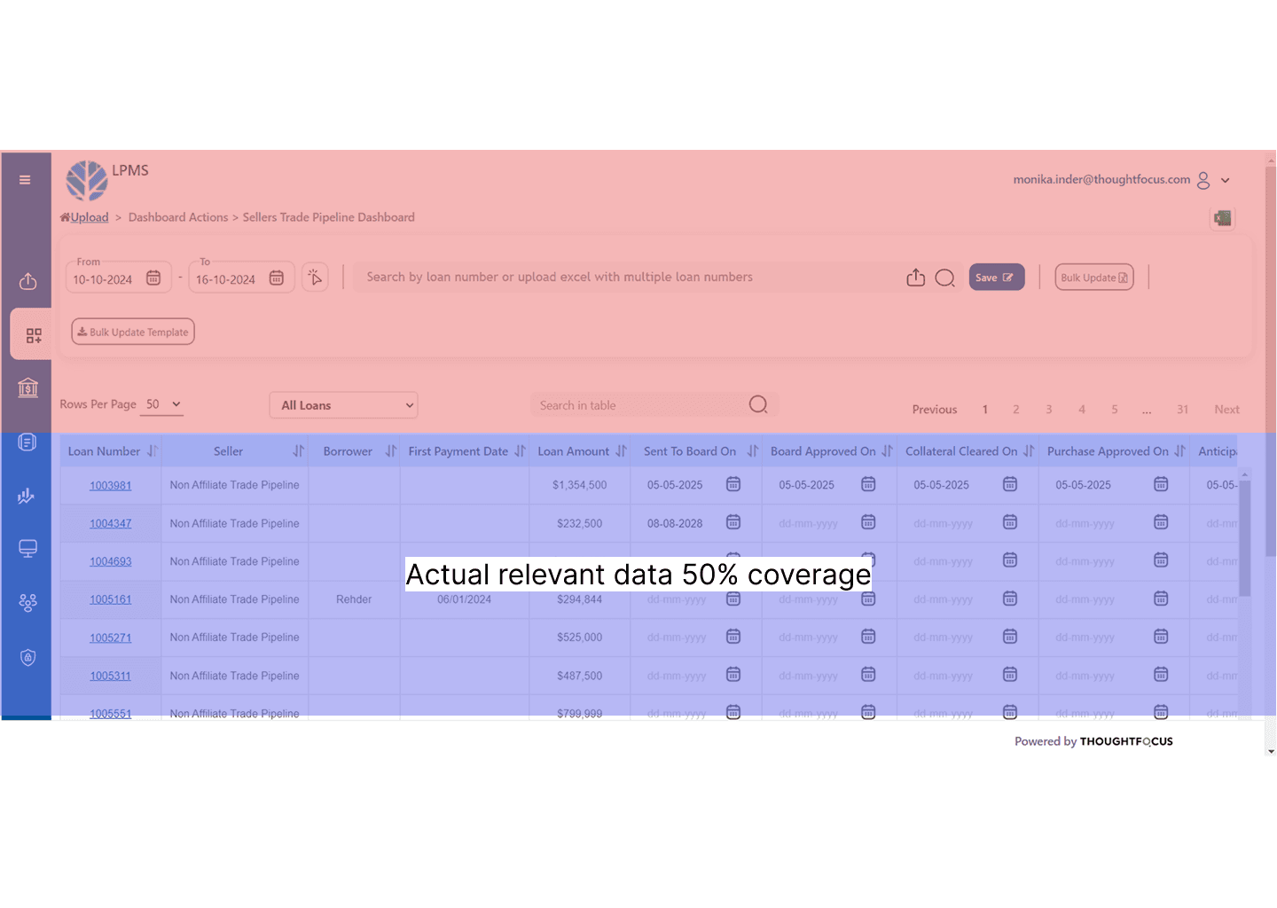
Screen Space Usage | Only 50% of the screen used for relevant data | Inefficient use of real estate; more scrolling required |
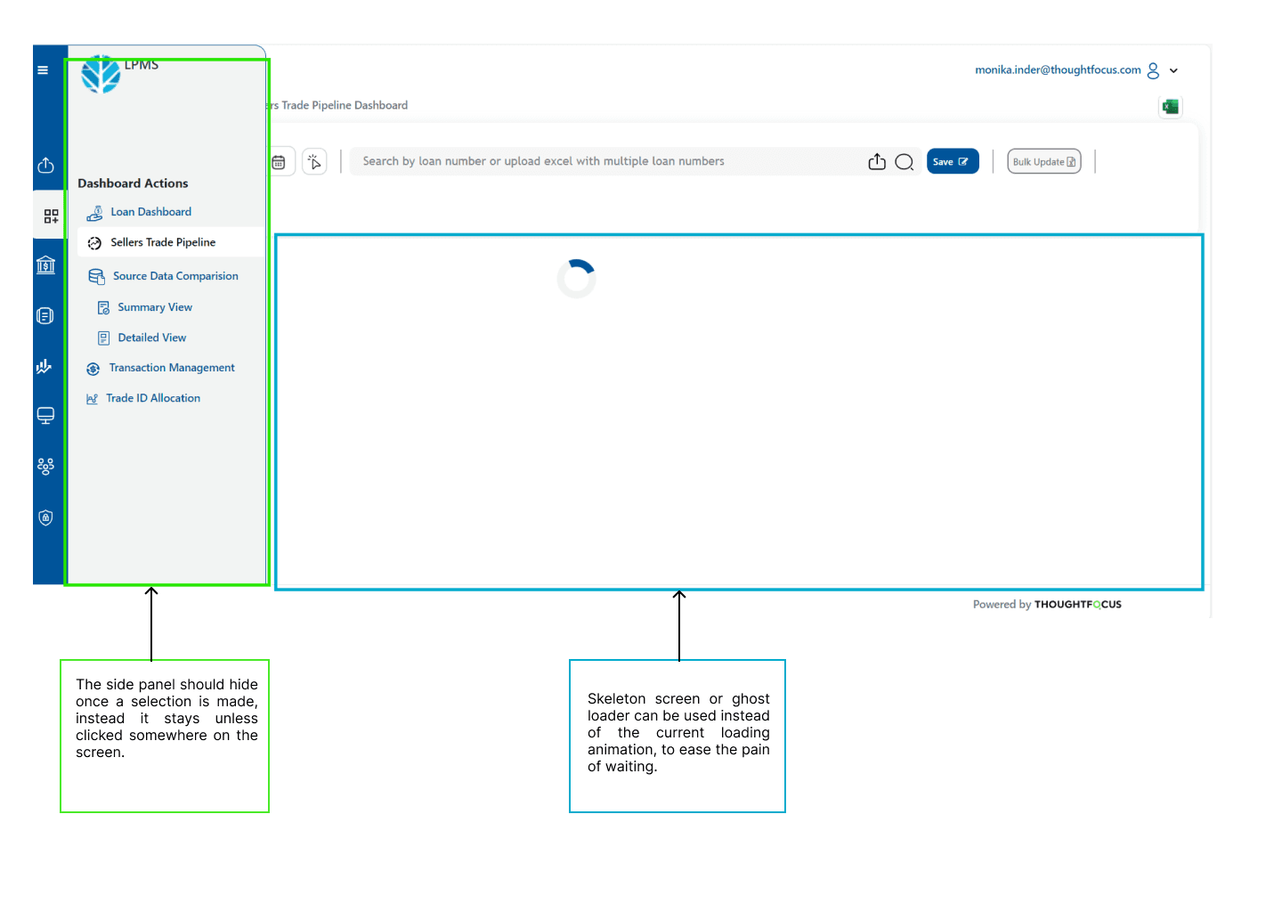
Loading Feedback | Spinner animation feels slow and empty | Increases perceived wait time and user frustration |
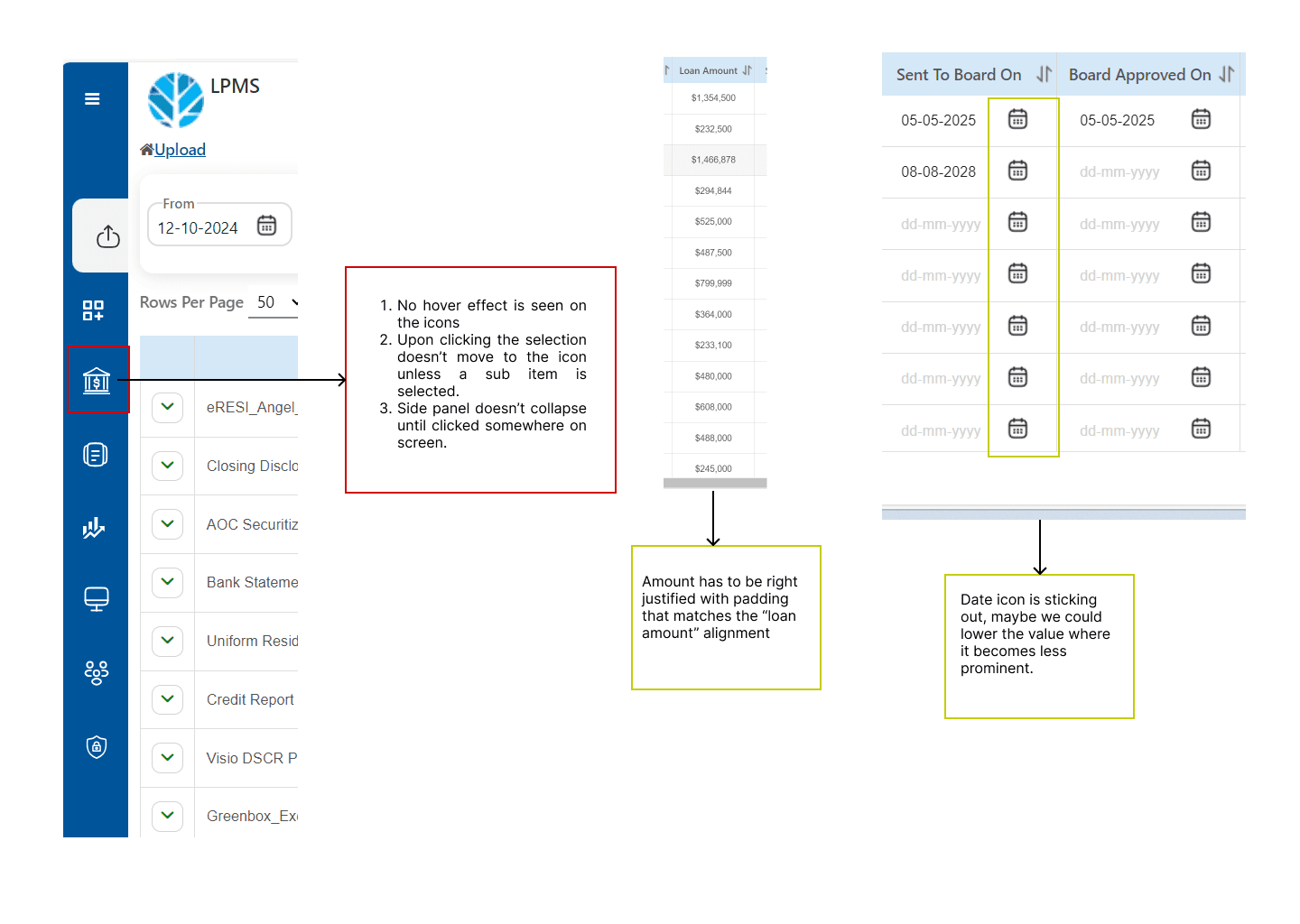
Navigation Panel | Does not auto-collapse; no hover feedback on icons | Slows user workflow; makes navigation unintuitive |
Data Alignment | Loan Amounts not right-aligned; date icons overpower dates | Reduces readability, especially for financial information |
Search and Controls | Search field not fully clickable; controls misgrouped | Wastes user clicks and causes friction |
4. Heuristic Violations
Consistency and Standards: Misaligned data, non-standard icon behavior
Aesthetic and Minimalist Design: Redundant button borders and heavy top panel
Recognition Rather than Recall: Missing hover states and unclear active selections
User Control and Freedom: Side menu does not auto-hide after action
Error Prevention: Empty columns without placeholders confuse users
5. Recommendations
Problem | Recommendation |
|---|
Misaligned data columns | Implement uniform row structure with consistent placeholder text (e.g., “N/A”) |
Inefficient screen space | Collapse filters/search bar after applying filters; allow table full-width expansion |
Spinner loading | Replace with skeleton screens to simulate page content |
Navigation usability | Add hover states and active selection highlights on sidebar icons; auto-collapse side panel after selection |
Misaligned numbers and dates | Right-align numerical data with proper padding; reduce date icon size or lighten color |
Search functionality issues | Expand the clickable area for the search input to the full visible space |
Button placement issues | Group related controls (e.g., Bulk Update Template next to Bulk Update) and reduce button borders |
Proposed Redesign
Full clickable search bar
Collapsible side panel upon selection
Skeleton loaders during data loading
Right-justified financial columns
Reduced visual noise in header controls
Optimized screen real estate for data display
8. Conclusion
This UX audit exposed critical design flaws hampering usability, causing friction, and reducing operational efficiency for LPMS users. By implementing these targeted improvements, the dashboard will become much more intuitive, efficient, and pleasant to use, ultimately contributing to better adoption rates and user satisfaction.