Modernizing B2B
Complete UX/UI revamp for a B2B SaaS application, improving usability and modern appeal.
B2B SaaS Product
Next Element
2024
Project Goals & Stakeholders
Overview
A B2B SaaS platform for enterprise resource planning (ERP) had grown outdated in both visual style and usability. I led the complete redesign of its web application to streamline workflows, improve accessibility, and align the product with modern design expectations for enterprise tools.
Role: Lead Product Designer
Team: Product Manager, Frontend & Backend Developers, QA, Customer Support
Duration: 6+ months
Tools: Figma
Primary Goals
Simplify the interface for better onboarding and adoption
Improve navigation and discoverability of core features
Align UI with brand and accessibility standards
Stakeholders
Product Owner
CEO & Management
Heuristic Evaluation & User Feedback
I began with a heuristic evaluation and user feedback analysis to identify friction points.
Key Issues Found:
Overloaded dashboards with dense, unprioritized information
Confusing multi-step workflows
Inconsistent component behaviors
Insights drawn:
Clear hierarchy of primary vs. secondary actions
Use of modern color systems and whitespace
Justify simplification of the top nav
Reorganize high-traffic modules

Information Architecture Redesign
The platform's original architecture had grown organically, leading to buried features.
What We Did:
Re-mapped the platform IA with a focus on user flows
Created sitemap and card sorting sessions with internal teams
Consolidated redundant modules and grouped related actions logically
Outcomes:
Streamlined navigation tree with max 2-click access to primary actions
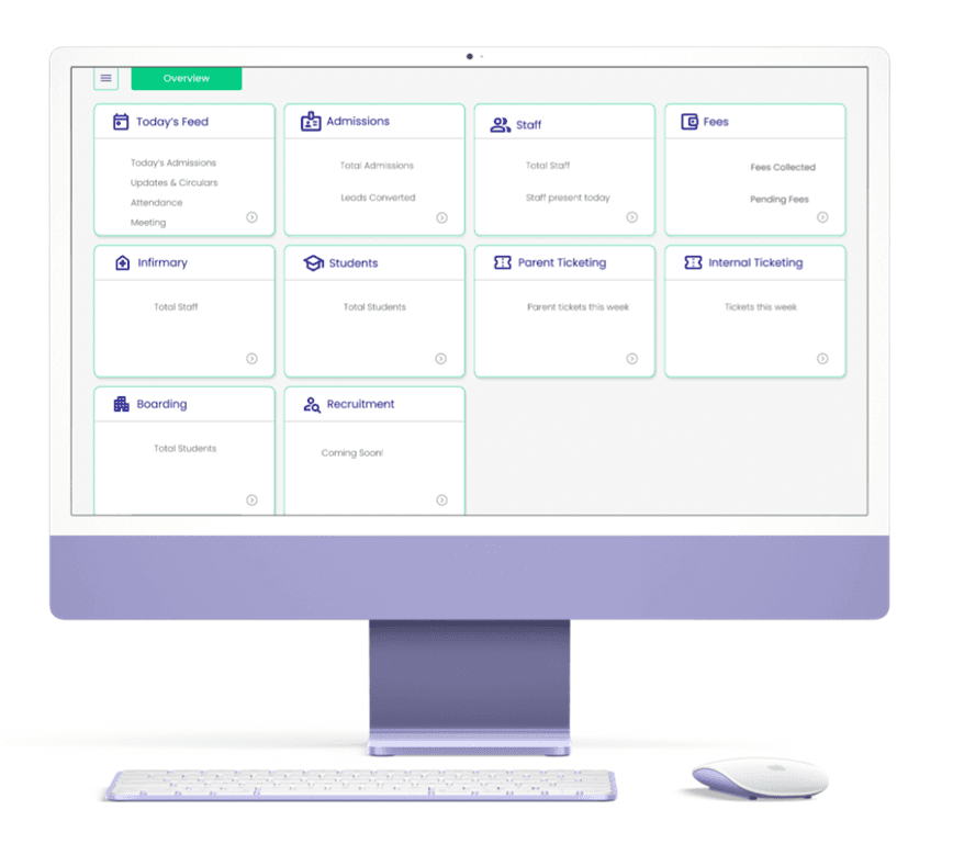
Clear dashboard layout with customizable widgets


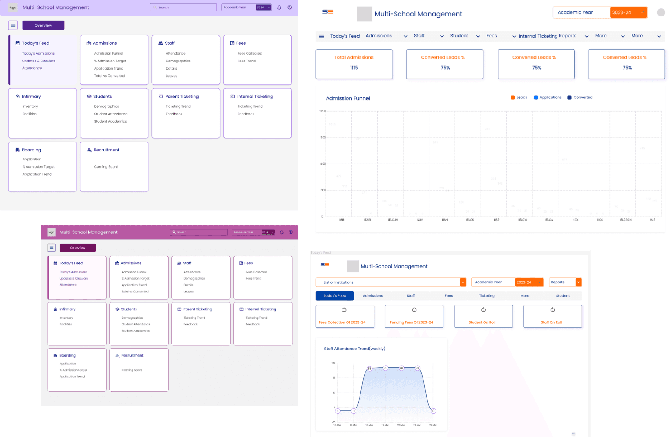
Mockups
Designed superceding landing page to provide quick access to information
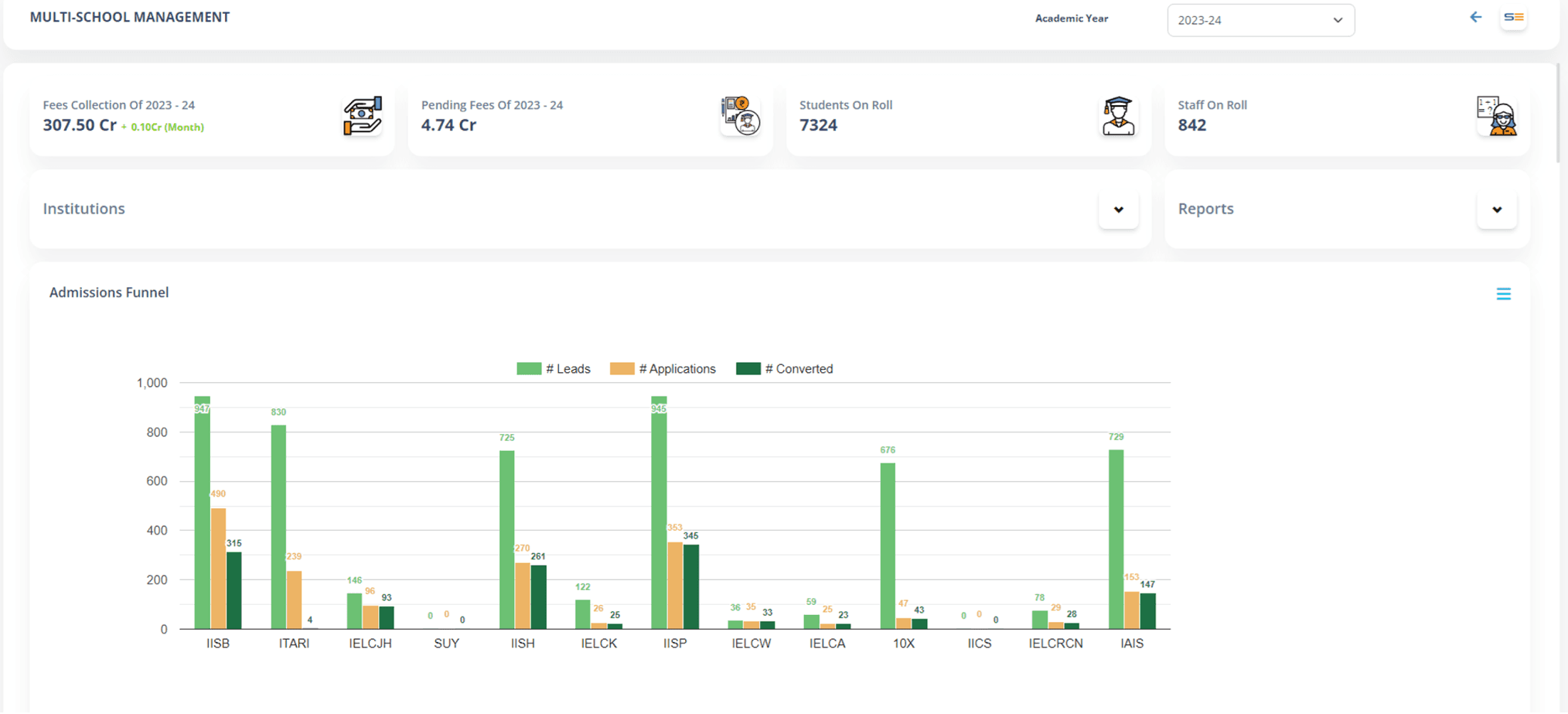
Added data visualizations using charts and tables
Reflection
This project strengthened my understanding of enterprise UX priorities, stakeholder alignment, and the importance of balancing business logic with human-centered design.